Background
This is a personal research project. I wanted to understand design systems so I decided to build one!
I was also interested in exploring how to build a design system that can bridge full-color touch screens as well as embedded hardware GUI. So I set myself a goal to develop a comprehensive UI design system that is not only consistent across multiple channels but also harmonizes interactions from digital media, like mobile apps to embedded OLED displays on appliances.
The primary emphasis of this project lies in standardizing a multi-channel experience, accessibility, and flexibility that allows the system to grow over time.
ROLE
UI/UX Designer
Research and requirements gathering
Identifying use cases
cross-functional alignment
Research and requirements gathering
Identifying use cases
cross-functional alignment
CHALLENGE
Scalable and responsive UI
Navigating this project posed several intriguing challenges. First and foremost, the design system needed to maintain a seamless consistency, not just across digital media like mobile apps but also across embedded OLED displays on various appliances. The app had to be scalable and responsive. Accessibility had to be designed from the get-go.
First design system
One significant challenge I encountered was the absence of an existing design system to reference. This meant I had to identify use cases and design components from the ground up, which required meticulous attention to detail and a deep understanding of user interactions.
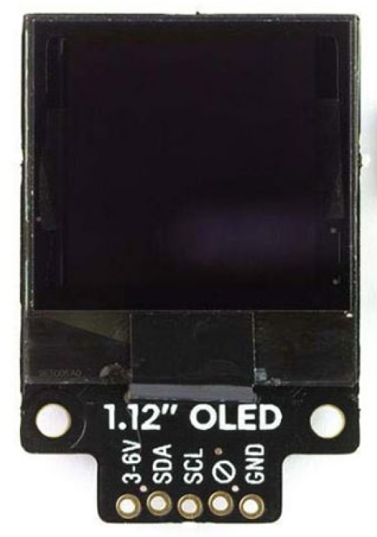
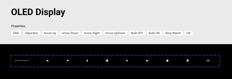
Embedded OLED display hardware
Additionally, a unique hurdle emerged when standardizing patterns and visual language for a compact 60x60 OLED display. This display will be embedded in appliances, along with two directional buttons and a tactile button which demanded a creative approach to optimize usability within such a confined space
sOLUTION
My proposed solution was a comprehensive multi-channel UI system meticulously tailored to both digital apps and embedded OLED displays. This versatile system not only provides a unified user experience but also serves as a crucial springboard for developers, enabling them to kickstart their software development journey with consistency and clarity.
APPROACH
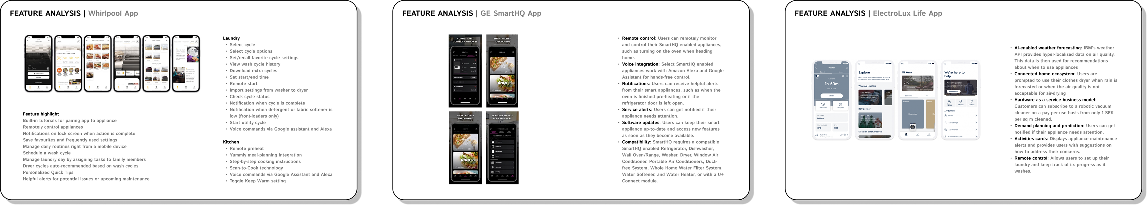
I began my process by brainstorming and doing a competitive analysis of similar companies in the amrt appliances space. I also looked at what features various other companies are offering and a general trend analysis of what is emerging in the HMI and app design space. This approach allowed me to discern the essential elements to incorporate into the Design System, ensuring it aligned with my project's specific needs and requirements.
Feature analysis across competing apps from OEMS and UI trends in HMI and mobile design


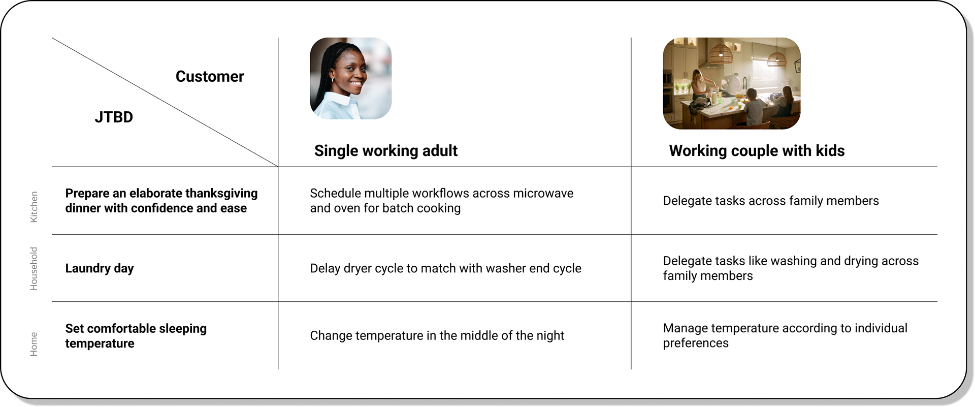
Customer profile + JTBD = Use cases
In the absence of any existing UI system, I had to understand what components I needed to design for. I started Analysing the customer profile across their JTBD to arrive at key use cases to design wireframes for. This gave me directions for the different component-level requirements.
DESIGN SYSTEM GOALS
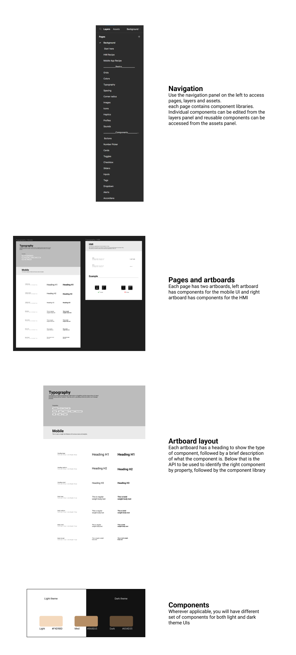
How to use
FUNDAMENTALS
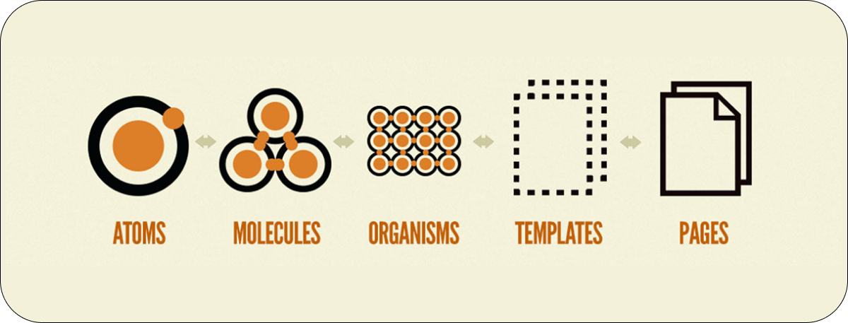
The Design system follows Brad Frost's Atomic design framework which is a process that consists of five separate steps that work together to build more coherent, hierarchical, and thoughtful interface design systems.
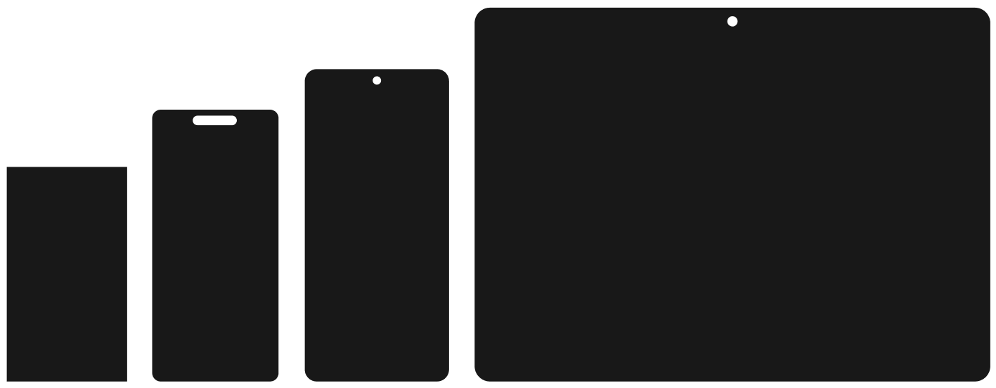
GRIDS
Mobile + Embedded OLED display grid
The following grid is responsive for screen sizes ranging from 320px - 1440px in width.
The following grid is responsive for screen sizes ranging from 320px - 1440px in width.
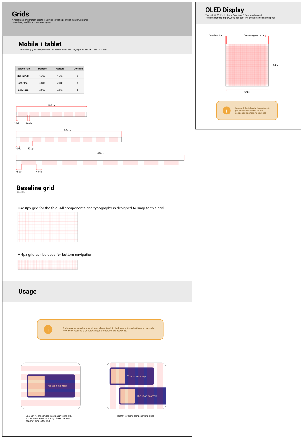
The design system allows for flexibility and creativity. Each component of the system comes with guidelines and boundary conditions that explain how components can be used in different use cases
SPACING
The following non-linear spacing values give enough granularity and spread to cover a wide range of screens
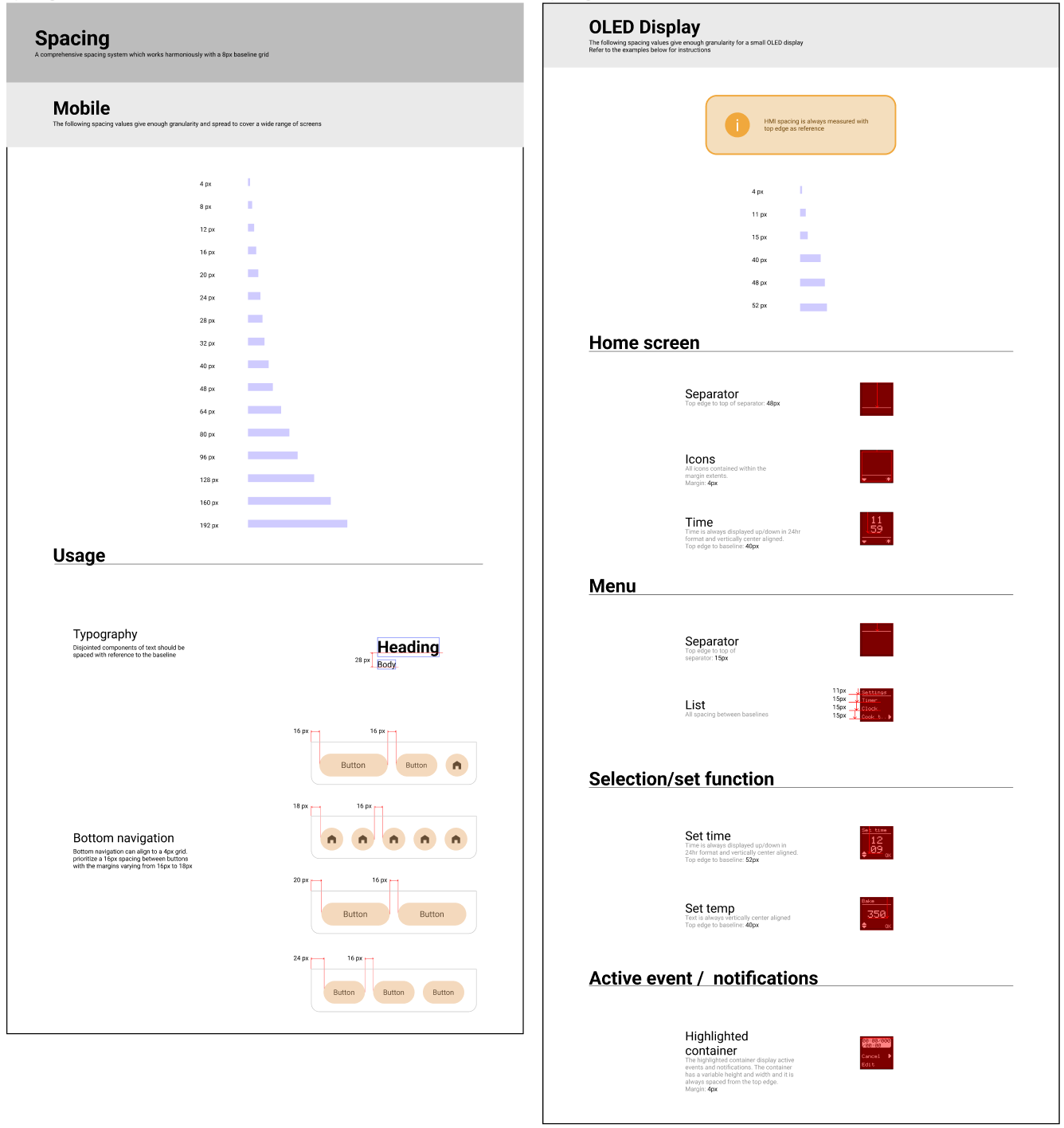
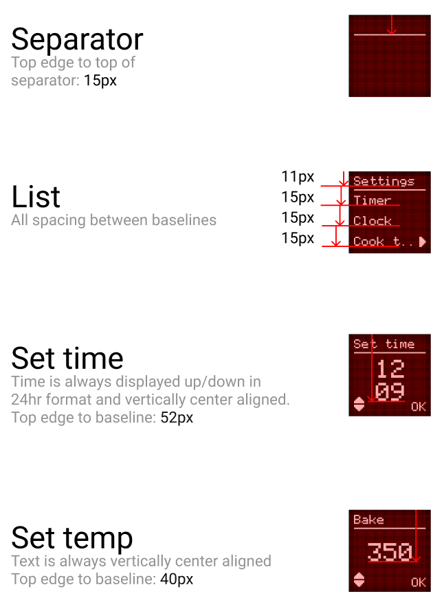
The OLED display has few patterns and hence it only needs a set amount of spacing values
COLORS
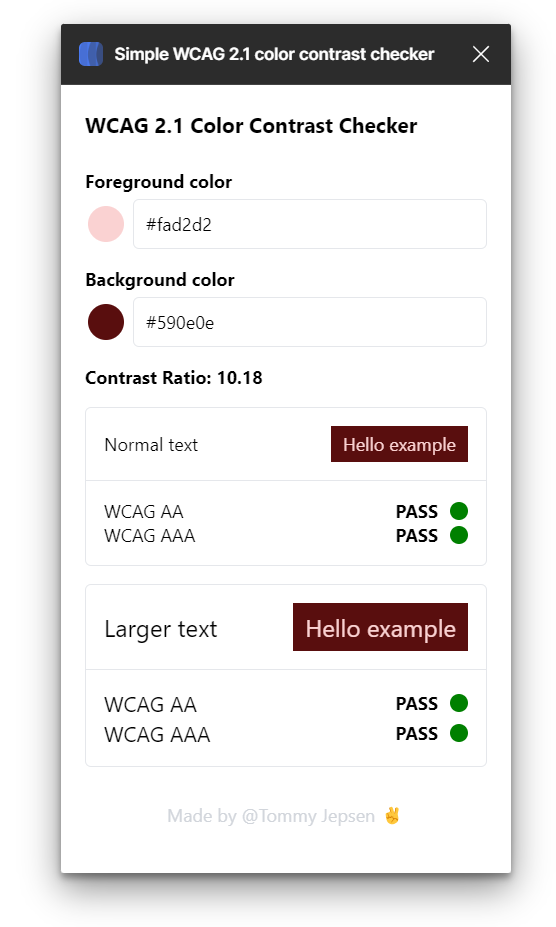
The use of color in your design system is important. They provide visual appeal but also convey important cues to the user. The colors were carefully selected based on the emerging brand colors and accessible color palette that meets the WCAG AAA color contrast standards.
All components that are stored as styles can be accessed through the following API. This is a common format for all components that can be stored as styles or variables.


All colors have been designed as per WCAG standards

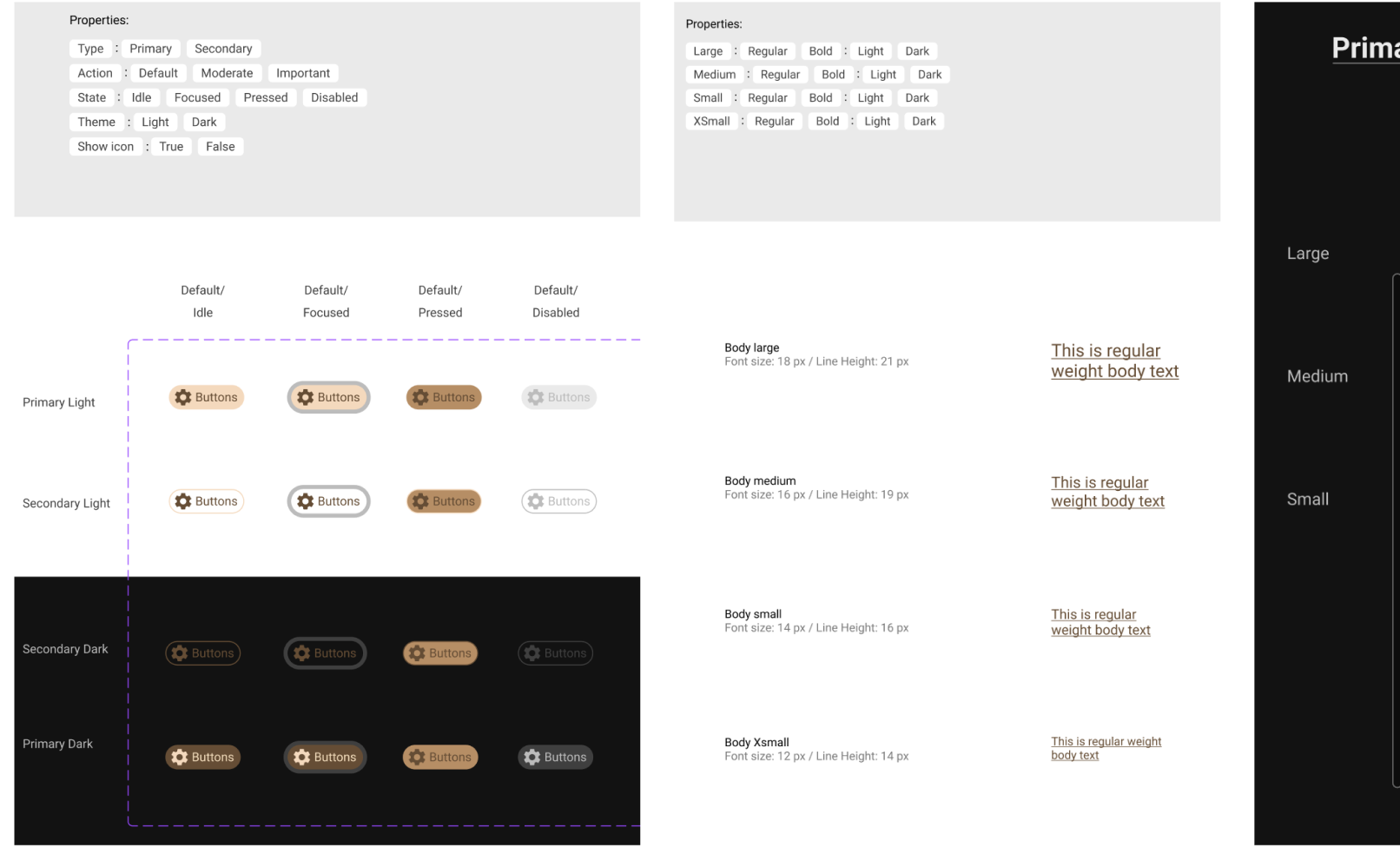
TYPOGRAPHY
Typography principles guarantee the optimization of legibility and the preservation of visual hierarchy across all our content. They also aid in upholding uniformity within our UI design process.
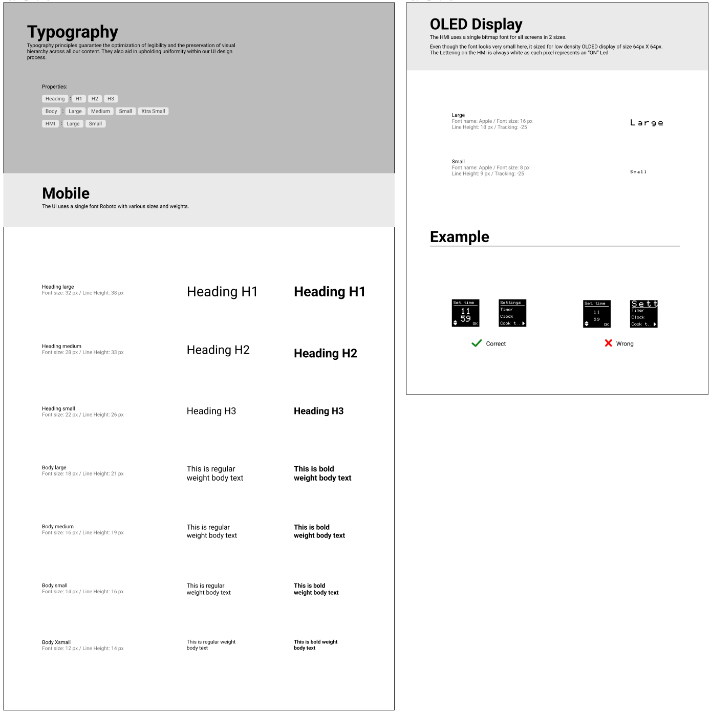
The OLED display uses a single bitmap font for all screens in 2 sizes.
Even though the font looks very small here, it is sized for a low-density OLDED display of size 64px X 64px. The Lettering on the HMI is always white as each pixel represents an “ON” Led
Even though the font looks very small here, it is sized for a low-density OLDED display of size 64px X 64px. The Lettering on the HMI is always white as each pixel represents an “ON” Led

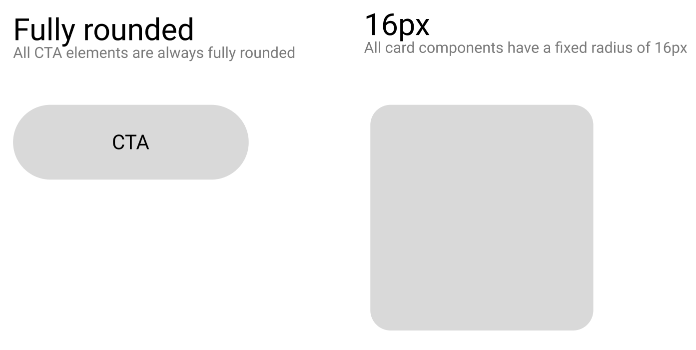
CORNER RADIUS
Corner radius ensures consistency in visual elements and CTAs
ICONS
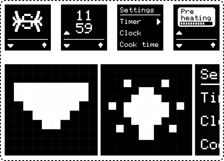
The icon set was still evolving, shown below are some icons I designed for the OLED display. Since this display is only 60X60 px, every icon had to be custom-designed. This component will keep evolving and growing into the future
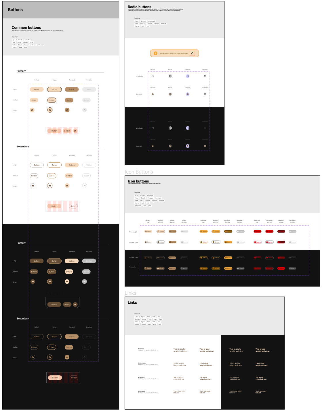
BUTTONS
So far in the process, we have a set of common buttons and radio buttons along with icon buttons
PATTERNS
Patterns were still in progress and evolving with the use cases and product. Shown below are only the most crucial patterns essential for common functionality.
Patterns were still in progress and evolving with the use cases and product. Shown below are only the most crucial patterns essential for common functionality.
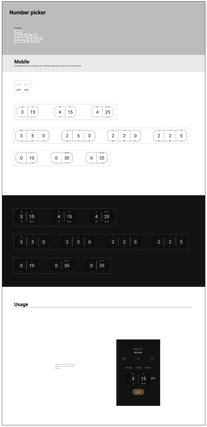
NUMBER PICKER
Can be used for various purposes, from setting temperature values to setting time
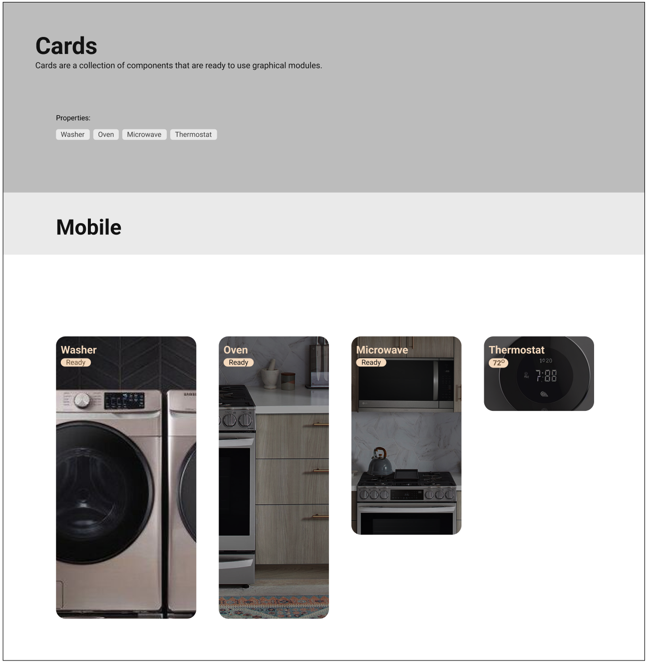
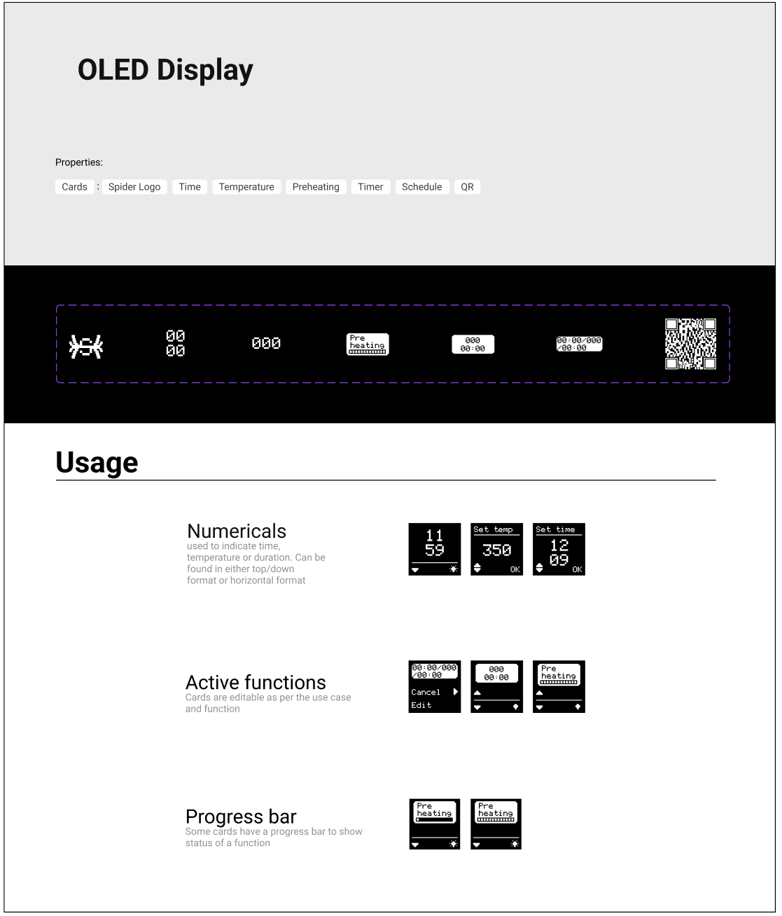
CARDS
Cards are a collection of components that are ready-to-use graphical modules.
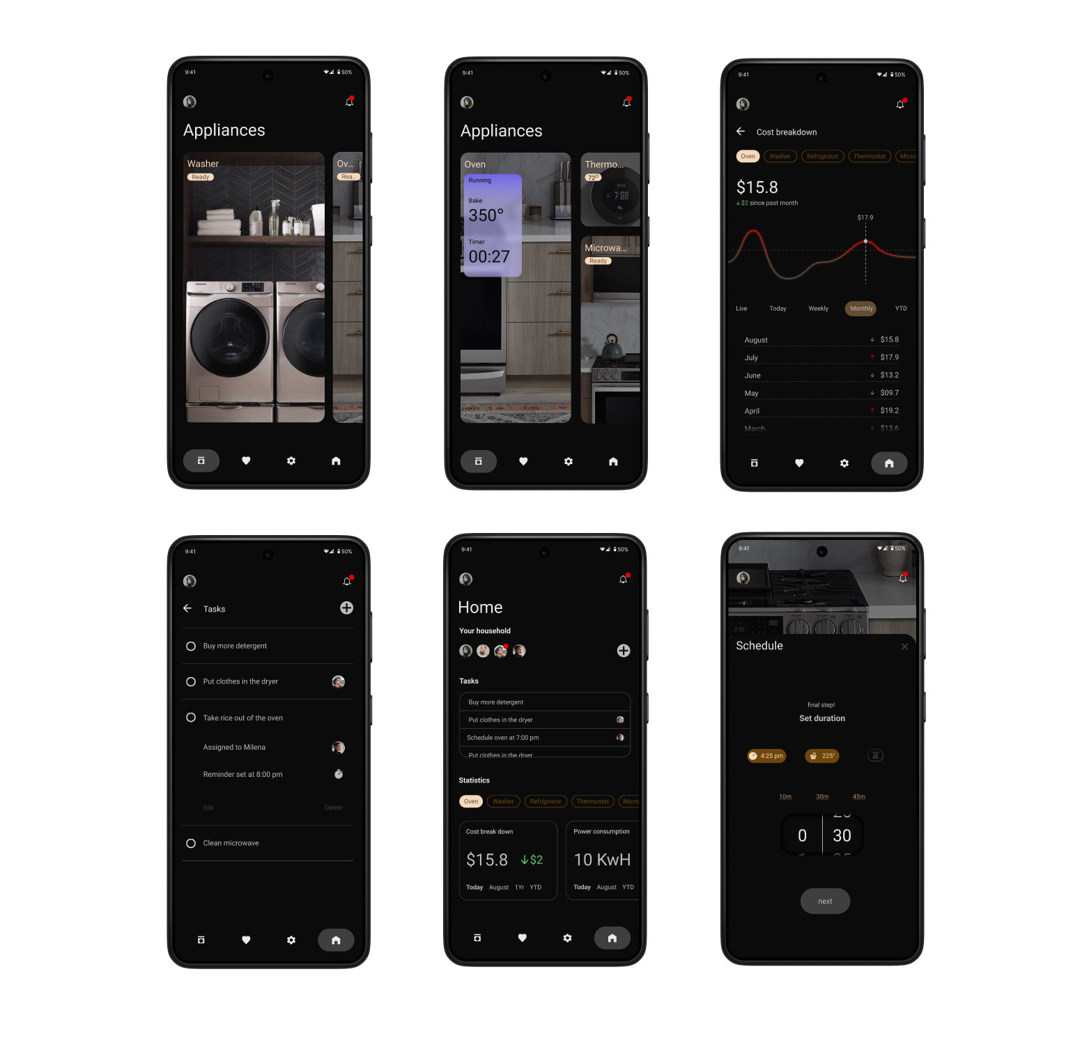
SCREENS
Shown below are some screens to capture the use cases mentioned above.